How to Make Your Squarespace Website Mobile-Friendly in 2026 (6 Simple Steps)
Nowadays, businesses must have a mobile-friendly website. Period. This isn't an option, it's a necessity.
Did you know that over 60% of all web traffic now comes from mobile devices like iPhones, iPads, Android phones, and tablets? In 2026, if your business website isn't mobile-friendly and easy to view on a small screen, you're potentially invisible to the majority of your potential customers.
There are currently over 5.4 billion internet users worldwide, and most access the web primarily through a mobile device. If your site isn't optimized for mobile, your brand isn't just behind — it's losing business every single day.
What makes a website mobile-friendly?
Your Squarespace website is considered mobile-friendly (or “responsive”) if it's been designed, developed, and optimized for users accessing your site on all standard mobile devices. Meaning, it looks great, loads fast, and is easy to navigate whether someone is on a phone, tablet, or desktop.
How can you tell if your website is mobile-friendly?
The quickest way is to simply pull up your site on your own phone and navigate through it as a real visitor would. Can you read the text without zooming? Are buttons easy to tap? Does the page load quickly?
For a more detailed check, open Google Search Console (free, just requires a Google account) and look under Experience → Core Web Vitals. This gives you real-world data from actual visitors to your site — which is far more useful than any automated test tool.
Why does mobile-friendliness matter for SEO?
Google now uses mobile-first indexing which means it crawls and ranks the mobile version of your site first, not the desktop version. If your mobile experience is poor, your rankings will suffer across the board, even for desktop searches.
Google accounts for nearly 95% of all internet search traffic. A site that isn't mobile-optimized is a site that Google is actively pushing down in results.
Try These 6 Steps To Make Your Website Mobile-Friendly in 2026
Keep Navigation Easy
When a website isn't mobile-friendly, it's often difficult to navigate, view, and use on a small screen. Visitors may have to zoom in to read content or scroll endlessly to find a button. This kind of experience leads to frustration and fast exits.
To keep visitors on your site:
Enlarge buttons, text, and menu options
Make sure tap targets are large enough to click without accidental misses
Keep your navigation menu simple and easy to find
Avoid dropdowns that are difficult to use on touchscreens
A confused or frustrated visitor won't stick around. And a visitor who doesn't stick around won't become a client.
2. Make it Responsive
Responsive websites automatically adjust their layout to fit any screen size so there’s no no pinching, zooming, or sideways scrolling required. Responsive design uses a fluid grid system that rearranges content to fit the device it's being viewed on.
This matters because your visitors are coming from dozens of different screen sizes. A responsive site ensures every one of them has a smooth, consistent experience.
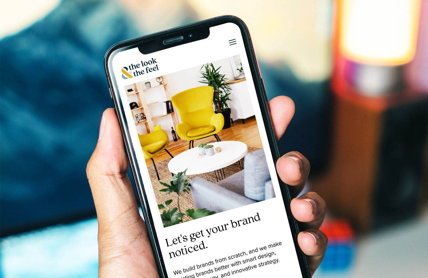
The easiest way to ensure your site is responsive? Build it on a platform that handles this automatically. Squarespace 7.1 is fully responsive out of the box — every template, including our Harmony and Arrive templates, is built to look beautiful on every device without any extra work on your end.

Already on Squarespace? (Or thinking about it?)
Our templates are built mobile-ready from day one.
3. Optimize Your Images
Large, uncompressed images are one of the most common causes of slow mobile load times. On a phone with a slower connection, a heavy image can make your entire page feel sluggish, and slow pages lose visitors fast.
Best practices for mobile image optimization:
Compress images before uploading using a free tool like Squoosh or TinyPNG
Use the correct file format — JPEGs for photos, PNGs for graphics with transparency, WebP when possible
Make sure alt text is consistent between your desktop and mobile versions
Avoid images that are too small or low-resolution — blurry images on a phone look unprofessional
4. Optimize for Speed and Core Web Vitals
In 2026, Google doesn't just care whether your site looks good on mobile — it measures how fast and smooth the experience actually feels. This is where Core Web Vitals come in. Core Web Vitals are a set of performance signals Google uses to evaluate user experience.
The three you need to know:
LCP (Largest Contentful Paint) — how fast your main content loads. Google wants this under 2.5 seconds.
INP (Interaction to Next Paint) — how quickly your site responds when someone taps a button or link.
CLS (Cumulative Layout Shift) — whether your page jumps around while loading, which is especially frustrating on mobile.
A slow or unstable mobile experience doesn't just frustrate visitors, it actively hurts your search rankings. Google has confirmed that Core Web Vitals are a ranking factor.
How to check: The quickest way is to simply pull up your site on your own phone and navigate through it as a real visitor would. Can you read the text without zooming? Are buttons easy to tap? Does the page load quickly?
For a more detailed check, open Google Search Console (free, just requires a Google account) and look under Experience → Core Web Vitals. This gives you real-world data from actual visitors to your site — which is far more useful than any automated test tool.
5.Use Standard, Readable Fonts
Standard fonts are much easier to read on small screens. Many mobile devices come with preinstalled web-safe fonts like Open Sans, Lato, or Roboto and these exist for good reason. They're clean, legible, and render consistently across devices.
A few rules of thumb:
Use a minimum of 16px for body copy on mobile, anything smaller strains the eyes
Avoid highly decorative script fonts for long blocks of text, they're beautiful on desktop but nearly unreadable at small sizes
Choose a clean serif like Georgia or a simple sans-serif like Lato for body text
Use font size variation intentionally to create hierarchy — big headlines, readable body, clear CTAs
On Squarespace, you can control font sizes for different screen sizes directly in the design editor, making it easy to fine-tune your mobile typography without touching any code.
6. Prioritize Clear, Concise Language
Mobile visitors are often on the go, scanning quickly and deciding fast. Long paragraphs and dense copy that works on desktop often feels overwhelming on a phone.
For mobile-friendly content:
Write shorter paragraphs — two to three sentences maximum
Use clear, descriptive headings so visitors can scan and find what they need
Include large, obvious CTA buttons — but not so large they dominate the screen
Cut anything that doesn't serve a clear purpose
Front-load your most important information — don't make people scroll to find out what you do
The goal isn't to dumb things down. It's to make your message as easy as possible to absorb on a small screen in a distracted moment.
How to Check if Your Squarespace Site is Mobile-Friendly
If you're building on Squarespace, the good news is that mobile optimization is largely built in. But here's how to make sure everything looks exactly right:
In the Squarespace editor, click the phone icon at the top of the editor to preview your site on mobile
Check every page and not just the homepage
Look for text that's too small, images that are cropped awkwardly, or sections that feel cramped
Test your forms and buttons to make sure they're easy to tap
Use Google Search Console's Core Web Vitals report for real-world performance data, it's a much more accurate measure for Squarespace sites than lab-based tools
If you're looking for a mobile-optimized starting point, our Squarespace templates are built and tested for desktop, tablet, and mobile so you can launch with confidence knowing your site looks sharp on every screen.
The Bottom Line
A mobile-friendly website isn't a nice-to-have, it's the foundation of your online presence in 2026. Get it right, and you'll rank better, convert more visitors, and make a stronger first impression on every potential client who finds you.
Need help making sure your website is truly mobile-ready? Let's talk.