Brand in a Bottle: Horyzon premium distilled rice spirit
Horyzon is an award-winning Atlanta-based beverage brand and producer of premium rice spirits. Using American heirloom grain to craft delicious spirits that draw inspiration from the past and reflect the best of modern America, Horyzon is the new spirit of the South. We worked with the Horyzon team to research their market and build a brand identity to help their bottles stand out on distributors’ shelves. The Horyzon product is inspired by the history and heritage of American rice farming. The brand look and feel showcases, celebrates, and incorporates the story and narrative of this unique heritage: the premium quality grain, its minimal production process, its complex flavor palette, and the lifestyle of enjoyment and creativity that comes with consuming the distilled spirit. The team at Horyzon needed a professional design agency and branding partner to build a research and strategy-based foundation for their brand message and develop a standout brand look and feel. The goal was to position the brand’s products amongst existing beverage brands and appeal to the target customer demographic of discerning, intentional, and thoughtful consumers. The project was starting from the ground up: so we began with market research, explored brand identity and strategy, and ultimately created a brand look and feel that is consistent and cohesive across all platforms, from the stunning logo and packaging to the web.


Beverage Branding Design
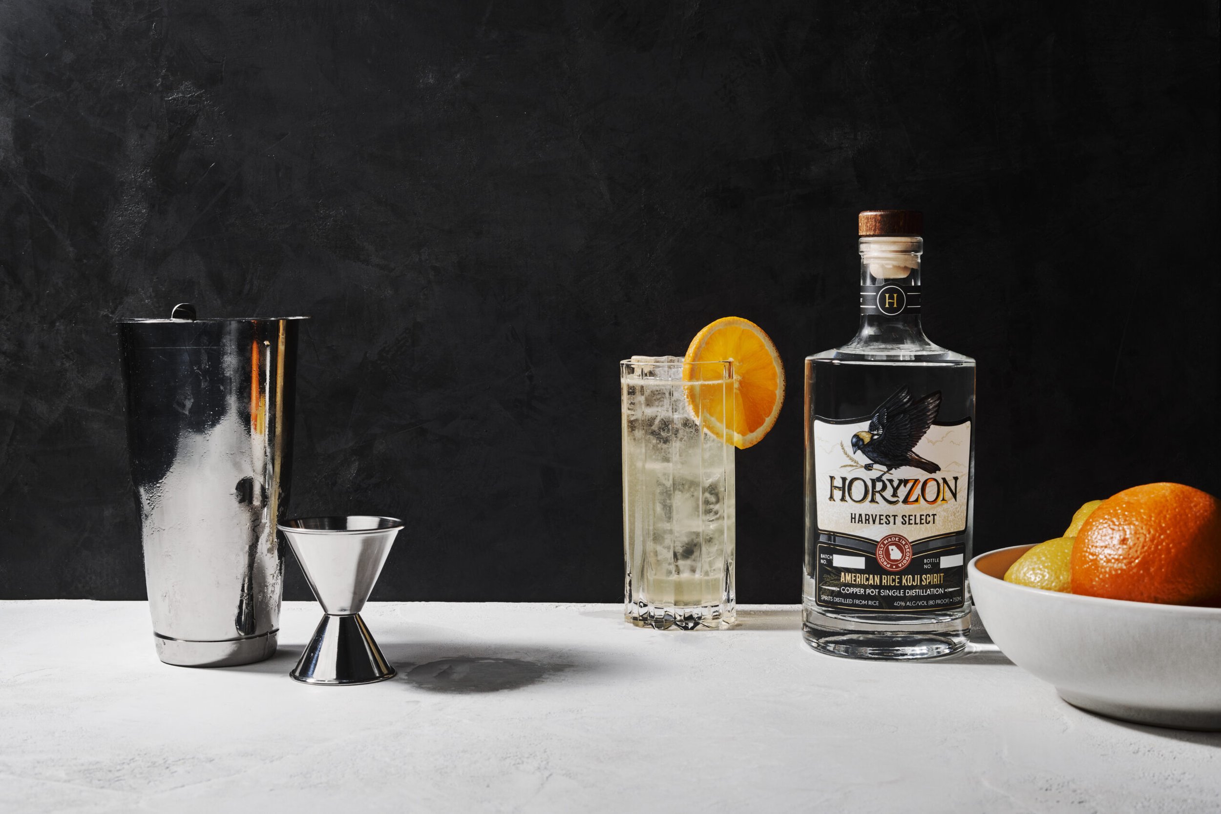
The Horyzon logo is sophisticated, elegant, and mature but also exudes warmth and is inviting. The icon is reminiscent of a rice paddy, shown in gold as a nod to the rising or setting sun on the horizon. This icon submark is a simple, artistic, yet memorable version of a rice paddy plant.
The "rice bird," featured in our logo, plays an important part in our brand story. The bobolink has been known to feed on rice fields while passing through southern farmlands during the migratory season. The bird faces to the East as an homage to Japanese culture and the people who created the tradition of distilling spirits from rice that we enjoy today.
The new brand presence and bottle packaging design helped Horyzon products win many awards, establish a firm footing in the marketplace, and capture the attention of its target customer audience of consumers, stockists, industry professionals, and distributors.


Progression of brand illustrations


Brand Guidelines
