7 Best Practices to Boost Nonprofit Website Engagement (and Increase Donations)
For most nonprofits, your website is often the first point of contact for your potential supporters, volunteers, and donors. It’s where people come to learn about your mission and your work and choose whether to take action and support your efforts.
The primary problem we see in our field as a nonprofit website designer? Many, many nonprofit websites fall short. They’re hard to navigate, not mobile-friendly, and/or don’t make the path to donating clear or convenient. Even if your cause is compelling, a poorly structured website can mean missed opportunities for connection and funding.
The good news (yay!) is that with a few strategic website updates, you can transform your nonprofit website into a powerful tool that engages your community and inspires involvement and generosity. Here are seven best practices for you to increase engagement and donations on your nonprofit website.
1. Put Your Mission Front and Center
Think of your website as the digital welcome mat of your organization—how do you want to welcome your visitor? When someone first lands on your website, they should feel welcomed and immediately understand what your nonprofit does and why it matters. Too often, organizations bury their mission in a subpage or overwhelm visitors with too much info or technical, complicated jargon.
Best practice:
Place your mission statement clearly on your homepage, ideally near the top.
Use plain, human-centered language instead of technical terms—write like you speak, in a conversational tone.
Support it with a compelling branded visual (like a photo or short video).
When someone visits your website, they should get your purpose immediately— and be motivated to explore further.
2. Simplify Your Navigation
If visitors can’t find what they’re looking for, they’ll leave. According to usability studies, people decide within seconds whether they’ll stay on a website. We always like to remind our clients that “a confused customer doesn’t act”; a confusing navigation bar or cluttered menu layout is one of the fastest ways to lose a visitor’s attention and trust.
Best practice:
Limit your main navigation menu to ideally 5 main items.
Make “Donate,” “Get Involved,” and “About” easily visible.
Use clear labels (e.g., “Our Impact” instead of “Reports” and “Links”).
Think of your navigation as a guided tour. Donors want to know what you do, who you help, and how they can contribute — don’t make them dig.
3. Optimize for Mobile
Nearly 65% of web traffic comes from mobile devices — and for nonprofits, mobile users are even more likely to engage on social media or donate directly from their phones.
Best practice:
Choose a responsive design platform (Squarespace excels here).
Test donation forms on multiple devices — are they fast and easy to complete?
Keep images optimized so pages load quickly.
Slow or clunky mobile sites cost nonprofits real donations. Mobile-friendly design ensures you’re not losing out on generous donors
4. Tell Stories, Not Just Statistics
Numbers matter, but stories move people. Donors want to see the human impact of their giving. A strong story connects emotionally, builds trust, and inspires action.
Best practice:
Create a dedicated “Stories” or “Impact” page.
Pair statistics with real stories of people or communities served.
Use a mix of formats: blog posts, videos, short quotes, or photo gallery
Story boosts engagement: feature a powerful story directly on your homepage to grab attention right away.
5. Make Donating Easy
The number one reason potential donors leave a nonprofit site? Frustration with the donation process. If it’s hard to find, takes too long, or feels scammy, people won’t follow through.
Best practice:
Place a bold “Donate” button in your top navigation and repeat it throughout your site.
Use a clean, convenient donation form with minimal required fields.
Offer suggested giving amounts alongside the option to customize.
Clearly explain where the money goes.
Include a privacy policy in your site footer.
Remember: your goal isn’t just to get someone to donate once — it’s to build long-term trust.
For a deeper dive on donation-friendly design, check out our guide to ADA-compliant websites. Accessibility is not just about compliance, it’s about inclusivity, which is core to building user-friendly websites and sustaining supporter trust.
6. Use Clear Calls-to-Action (CTAs)
Every page of your site should guide visitors toward an action: donate, volunteer, sign up for your newsletter, share on social media. Without clear CTAs, visitors may leave without engaging.
Best practice:
Use action-oriented language: “Join Our Mission,” “Start Giving,” “Become a Volunteer.”
Place CTAs strategically at the end of pages and within content.
Don’t overload — one clear action per page is ideal.
When CTAs are clear, direct, and repeated, visitors are much more likely to act.
7. Build Trust With Transparency
Donors want to feel confident that their money will make a difference. If your website doesn’t communicate transparency, you risk losing support.
Best practice:
Share annual reports or impact summaries.
Highlight testimonials from volunteers, partners, or beneficiaries.
Include honest and friendly information on leadership, board, and staff
Make your contact info visible and easy to find (we recommend putting it in the footer).
Trust builds loyalty, and loyalty fuels sustainable giving.
Bonus: Keep Your Website Fresh
An outdated site signals an inactive, stagnant organization. Watch out for cobwebs! Updating your blog, events page, or about us bios regularly shows that your nonprofit is active, thriving, and deserving of support.
If maintaining content feels overwhelming, a platform like Squarespace makes updates simple — and with the right brand foundation, your website becomes a living tool, not a burden.
Some Final Words of Encouragement
You’re already doing great work and your website is one of your nonprofit’s most valuable tools to showcase your impact. With a few intentional updates, from simplifying navigation to improving mobile design to making donating easy, you can turn casual visitors into committed cheerleaders.
Every click, every visit, every interaction is a chance to tell your organization’s story and inspire someone to get involved.
Don’t let your nonprofit’s outdated website hold back your organization’s mission. With the right website strategy and support, your nonprofit can build an online presence that appropriately reflects the positive impact you’re making in the world.
Ready to give your nonprofit’s website an upgrade?
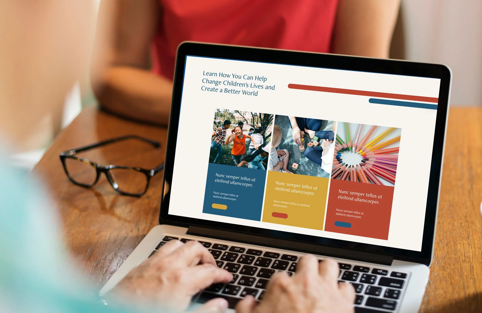
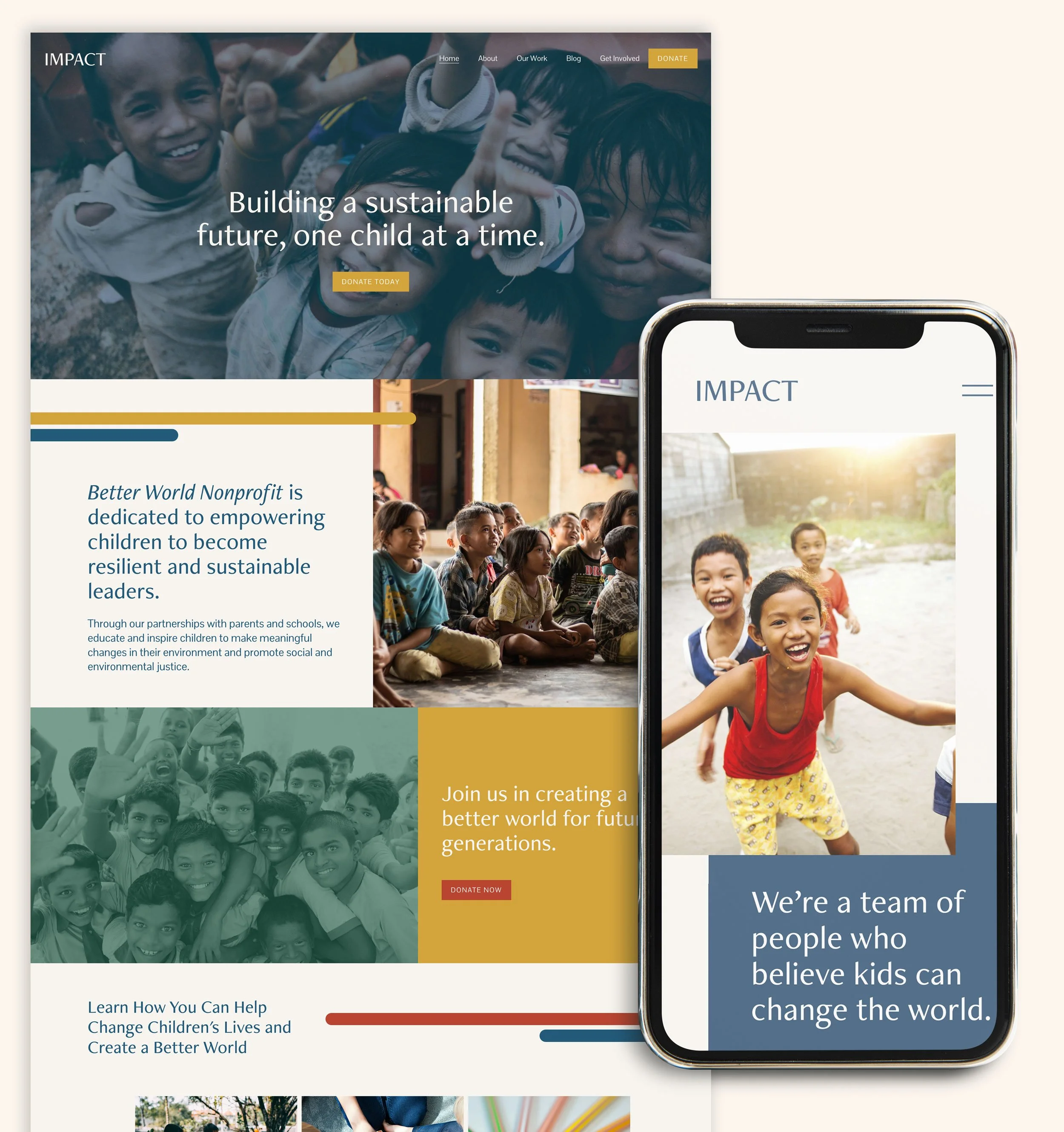
Our made-in-house Squarespace layout, Impact, is an upbeat and welcoming design crafted for nonprofits aiming to showcase their message, radiate positivity, and look professional. This contemporary and lively framework merges modern aesthetics with practical design elements. With Impact, you'll find a layout that exudes both energy and approachability, perfect for those seeking a dynamic and inviting digital presence. Enhance your nonprofit's brand with Impact, where the framework speaks volumes about your dedication to making a positive change, highlights your purpose, and presents a fresh approach to your community engagement.
EXPLORE EMBARK
How Embark Helps Nonprofits Build Engaging, Donor-Friendly Websites
With Embark, we specialize in helping nonprofits create websites that aren’t just beautiful — they’re strategic. That means:
✅ Clarifying your brand message so supporters know who you are and why you matter
✅ Designing a clean, mobile-friendly Squarespace website that builds trust
✅ Structuring your site to maximize engagement and donations
✅ Crafting copy and visuals that connect emotionally and inspire action
✅ Setting up SEO foundations so more people can find your mission online
We know you don’t just need “a website.” You need a site that supports your mission, engages your community, and helps you raise more funds.
If you’re ready to create a website that works as hard as you do, start here to see how we can help.